Column-view message threading in Mail
I pitched a number of ambitious ideas when I worked on Mail in the early-2000s. Most didn’t get very far, with Magic Mailboxes being the notable exception. When we were considering adding threading to Mail, I pitched the idea of using a column-view interface.
I have no visual design skills and I’m not very good at pitching things, but I gave it a good try. I presented the idea at a meeting with our representative from the Human Interface Group and Scott Forstall (I don’t recall what his position was at the time). I was disappointed he shot it down, but not particularly surprised.
Here are the ideas I jotted down sometime in 2003 (I think). I left it in original form and [I’ll put any commentary in brackets].
Column-view email threading proposal (unedited)
Why this is really important
- Many email clients have threading support and threading UIs, but none of them are very good
- Threading is an incredibly useful idea that every Mail user could benefit from
- I think this is an opportunity to catapult ourselves over other clients in terms of usability
How other clients do it
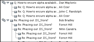
Every other client that supports threading uses a nested list view (like the Finder) to present an ever increasing hierarchy of messages. Just like with Finder’s List View, it’s a repetitive exercise in flipping and unflipping disclosure triangles, that is only made (somewhat) easier with an endless set of keyboard/menu commands (Next Message, Next in Thread, Next Thread, Previous Thread, Previous in Thread, Previous Message, etc). It’s also presented as a mode that you must enter and exit, making it less appealing to even advanced users that can understand how it works.
[I really hate list views].
Proposal: a column-view interface for threading
Essentially, an iPod-style interface, with one ‘column’ showing at a time. The message list would look exactly the same as it does today, with the addition of arrow icons in the message list to indicate which messages are part of a thread.
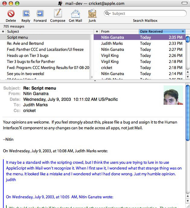
Here’s an example of how the message list would look when first opening a mailbox. [Note that the idea was that the mailbox would look no different than it did before threading existing. Messages did not get coalesced based on being part of a thread. The idea was that threading would be “always on” and those that chose not to use it wouldn’t notice anything different other than the arrows indicating there’s more than one message in the thread.]

“Standard” View:
Messages that are part of threads would indicate this with a right arrow icon at the right edge of the message list, similar to how both column view in the Finder and the iPod indicate this. Hitting the right arrow key when the message shown above is selected would swap the message list (using a column view style animation) with this message list:
“Threaded” View:
Note that the same message is selected as before, the same sort order is preserved, but now we see all messages that are part of this thread displayed. Left arrow would bring you back to the original message list.
Sent messages integrated in the list of messages for a thread
A really important (and cool feature here) would be the integration of your sent messages with the messages in a thread, allowing you to see an entire back-and-forth correspondence with one person or a group. In the screenshot above, note that messages I’ve sent are integrated into this ‘thread’.
[Believe it or not, the original design for the list-view-based thread interface was to NOT include sent messages. I argued that this was the main reason for having threaded view at all. The mindset was helping people manage high-volume mailing lists in a work environment rather than the more typical back-and-forth correspondence a home user might experience. Threaded views were typically an advanced user feature and I saw it as something that everyone would find benefit from. The shipping version of Mail threading included sent messages.]
Simple arrow key navigation
Using only left and right arrow keys, it would be possible to jump in and out of threads, without needing a dozen keyboard shortcuts that other clients have had to devise to deal with thread navigation. The arrow icons in the UI would serve as a great mnemonic and would likely be highly discoverable.
Always on
Using this threading UI, we could ship it in an ‘always on’ configuration, so that all users could derive benefits that threading provides, not just power users that have grown up on newsreaders. [Ouch!] The default configuration would allow Mail to run as it currently does, while providing an easy way to jump into threads without changing modes.
Flat threading hierarchy
In the screenshot from Netscape (see first screenshot in this message), note how the same thread has split into subthreads, leading to a nested hierarchy that could theoretically go on forever.
A one-to-one correspondence, when viewed in a List View threaded mode would look like this:
Message 5 (Your reply to Message 4)
    Message 4 (My reply to Message 3)
        Message 3 (Your reply to Message 2)
            Message 2 (My reply to Message 1)
                Message 1 (The original message sent by you)
A column view style display would allow you, for example, select Message 3 in the Inbox, hit the right arrow key, and see this:
Message 5
Message 4
Message 3 (highlighted/selected)
Message 2
Message 1
This would show you precisely where the selected message fits in with the rest of the messages of the thread, allow you to jump back to the first message, or read messages that have come in later than Message 3.
[Note that a flat hierachy is the norm today in social media like Facebook and Twitter. Not that this necessarily validates my design!]
A summary of the advantages of this threading UI:
- Power of threading available to all users, not just power users
- Uses column view style browsing that is used by the iPod and popular with users of the Finder
- Essentially modeless operation (threading could always be ‘on’, since current behavior of the message list would be preserved).
- Simple keyboard navigation (only uses left and right arrow keys)
- Easier to select and act on messages in a thread (i.e. what does a ‘select all’ do when a message is selected in part of a thread showing in List View?)
- Better use of horizontal space (since there is no indenting)
- Threads could become virtual mailboxes in Mail (much like we’ve talked about virtual search mailboxes)
- Issue with sort order are less problematic to solve (i.e. When you sort by date, does that mean sort the top-level threads by date or sort items within a thread by date?)
- Sent messages are integrated (a top requested feature from customers)
Why it’s better even for power users:
- Multiple entry points to a single thread
- Easy to jump in and out of threaded mode for those that like to switch contexts often
- Highly favors easy keyboard navigation, most often used by power users
Why List View threading is a terrible interface for threading
Summary
- Keyboard navigation is excruciating
- Lots of flipping and unflipping triangles
- Lots of scrolling to arbitrary locations in a list of messages
- Lots of switching in and out of threaded mode to see messages sorted by date
- Completely unusable in the INBOX
- Difficult and cumbersome to act on entire threads at a time
- Requires lots of new keyboard shortcuts and menu item commands
[Not that I felt strongly about it or anything.]
For the sake of example, I listed a number of common operations that threading potentially offers users, and how List View compares to Column View threading:
Selecting all messages in a Thread
- List View
- Scroll to arbitrary location, click mouse, scroll to arbitrary location, shift click mouse
- Use ‘Select All Messages in Thread’ menu command, if available, or the command shortcut, if available
- Column View
- Right arrow (if needed), Select All
Moving to the beginning/end of a thread
- List View
- Scroll to arbitrary location
- Column View
- Scroll to beginning or end of message list, or use Home or End keys
Note: Don’t underestimate the drudgery of scrolling to arbitrary locations! It’s far easier to drag a scroller to the beginning or end of a list or to use Home and End than to attempt to nail the beginning or end of a thread in a long list of threads/messages
Deleting/transferring all messages in a thread
- List View
- Scroll to arbitrary location, click mouse, scroll to arbitrary location, shift click mouse, Select All, delete or transfer
- Use ‘Select All Messages in Thread’ menu command, if available, or the command shortcut, if available, then Select All, then delete or transfer
- Use ‘Delete All Messages in Thread’ menu command, if available, or the command shortcut, if available
- Column View
- Right arrow (if needed), Select All, delete or transfer
Note: In List View, there is a serious problem when transferring/deleting the parent message in a thread. Most threaded email clients just act on the parent message and don’t bring the entire thread along for the ride. If we want to act on the whole thread, how do we distinguish that from a normal drag of the parent message? With Column View threading, this is far less ambiguous.
Opening/closing a thread
- List View
- Scroll to arbitrary location, click on flippy triangle in arbitrary location
- Column View
- Right arrow to open, left arrow to close
Navigating messages in an unthreaded view
- List View
- Exit threaded mode via menu command, keyboard shortcut, or window widget
- Column View
- Left arrow key
Seeing sent messages as part of thread (a top user request)
- List View
- Not supported
- Column View
- Integrated into the thread
[What about compared to the leading brand! Note that this was not supported at the time I wrote this.]
Finding unread messages in a thread
- List View
- Scroll to arbitrary location, possibly offscreen, check to see if any unread messages exist
- Devise another level of hierarchy on top of the existing List View hierarchy to separate unread messages from read messages
- Invent another new widget to hide/reveal read/unread messages
- Column View
- If thread is shorter than the number of messages that the message list can display, you just see your unread messages (Note that even short threads could end up with offscreen unread messages in List View)
- If thread is longer, scroll to the beginning or end of the message list (depending on your sort direction)
- Status Link could indicate unread message count in the thread, so you could know ahead of time if there are unread messages (In List View, this could only be accomplished by overloading the status line or putting individual unread counts at the top of each thread in the message list).
Sorting a thread’s children differently than thread parents
- List View
- Either impossible or incredibly messy, possibly involving introducing a second tier of sort columns inside of each thread
- Column View
- Threaded and unthreaded are separate views, so this is not a problem
Alternative interface ideas
[I toyed with the idea of the message list becoming a split-view when you selected a message that was part of a thread. In the screenshot below, after selecting the message from Nitin, the left column would start showing the thread subjects and the right column would show individual messages in the thread.]
[There was also an idea of including a 4-way control, which I stole from DVD Player (I think?) for this screenshot, to navigate in and out of threads as well as within a thread].
End of column-view email threading
Present day
It’s obvious I felt pretty passionate about this when I go through these old notes! I took some solace in the fact that the list-view style threading was eventually removed from Mail in favor of the new “conversations” view. This includes some of the ideas I was proposing and I think it’s definitely a big step forward.
