iMail: The email client for everyone (else)?
When I worked on Mail in the early 2000s, every incoming bug report and feature request from users was processed and tracked by me. I also provided on-the-spot Mail support for everyone in macOS engineering. I was in a unique position of knowing the things people struggled with in Mail.
I was always trying to push Mail in the direction of simplicity and higher usability, but there were always these major roadblocks:
- Email clients had worked fundamentally the same way for a very long time, so there was a LOT of resistance to change.
- Innovations that required email servers to add new functionality were dead on arrival.
So I experimented with ideas for a new email client that I dubbed “iMail“. Think of it as the email version of an app like iMovie or iPhoto. Since Apple had recently started running their own email servers as part of .Mac (now called iCloud), here was a chance for client and server to innovate together.
This never became an official project although certainly some ideas were eventually implemented in Mail.
I documented the results of the brainstorming and compiled the very rough content you’ll see below. I’ll leave it unedited and add [some present day comments in braces]. I thought it would be interesting to look back at the concept.
iMail proposal (unedited)
[Note that there are 8 times as many internet users today as there were back then. Billions of people that were new to the internet].
Why iMail?
Does the world need another email client? Doesn’t it have enough already?
At MWSF 2003, many people wondered why Apple released Safari into an already crowded browser market. Two years earlier, many wondered the same thing about iTunes, released into a an already crowded market. In both cases, the reasons were simple:
- None of the existing products were remarkably easy to use
- Innovation had dried up and stagnated years before (some people call this ‘product maturity’)
- The functionality these applications provide are critically important to computer users
The same has been true in the market for email clients. No major new email clients have been released in the last 5 years. Innovation has completely dried up and this has incorrectly been hailed as a sign that the market for email clients has ‘matured’. What’s really happened is email client vendors have run out of ideas and have instead spent the last five years in features arms races with each other, while failing to recognize these critically important facts:
- People universally feel unable to manage their ‘flood’ of email
- Email is inherently simple. You send, receive, file, and find email. It isn’t more complicated than that for the vast majority of people
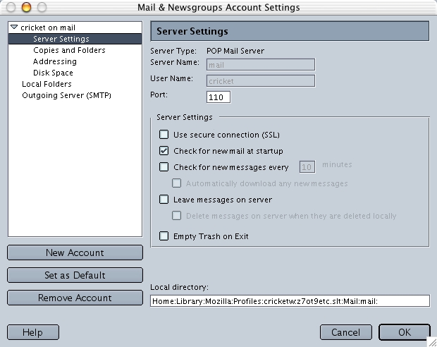
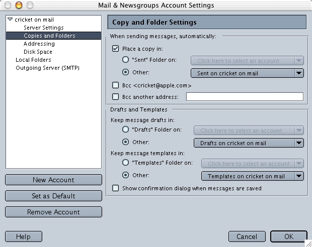
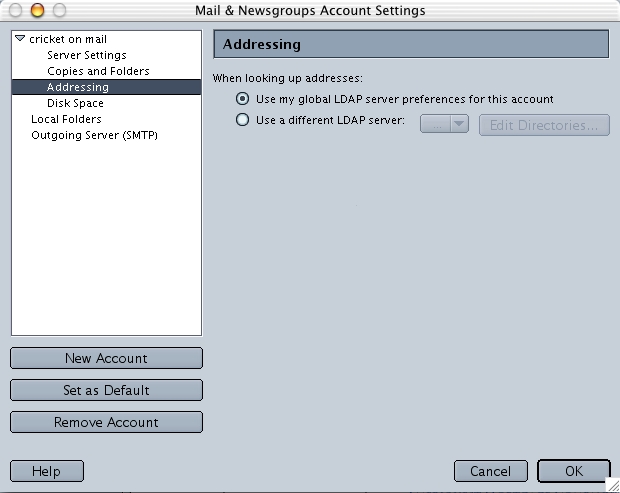
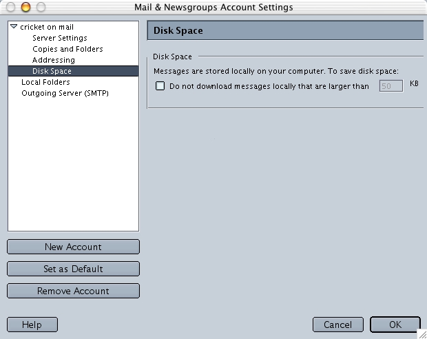
- Most users are intimidated with their email clients and have no idea how to solve problems when they occur
Why can’t an email client be as easy as iTunes?
Good question! The typical iTunes user needs the following functionality:
- Get songs into iTunes so they can be played
- Play songs
- Find songs immediately
- Organize songs using dynamic categorization
Here’s what a typical email user needs:
- Send and receive email, with or without files attached
- Read email
- Find stored email immediately
- Organize email using dynamic categorization
There is not much difference there. The typical iTunes user doesn’t need to leave the single window to get all the functionality they need. It’s highly likely that the typical user never even needs to use any menus or set any preferences. This is the kind of design that is perfect for the kind of user that just wants to use the system and have it do what they want it to do, without needing to read a manual or grasp concepts such as IMAP vs POP or local versus server-side storage
What has every other email client done to help address these problems?
Over the years, other email vendors have layered new features on top of old ones in a vain attempt to make you feel like it’s easier to manage you email.
Example:
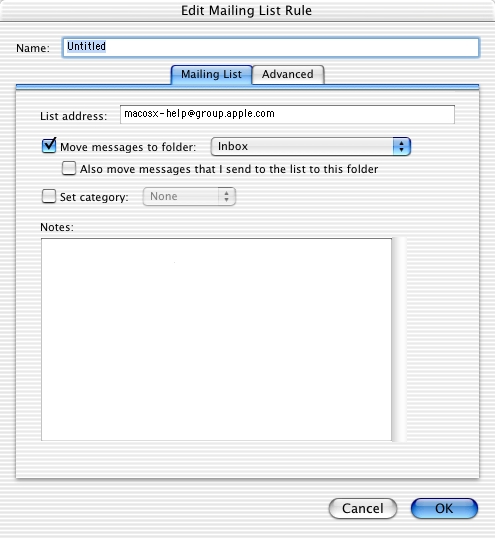
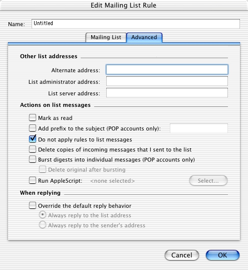
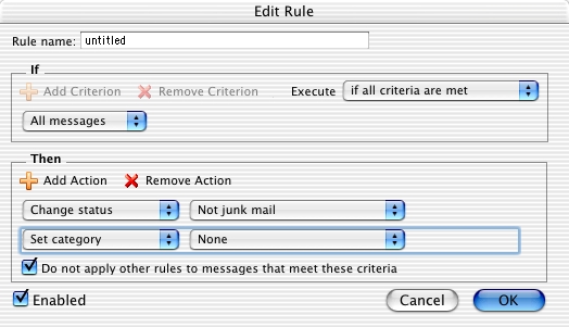
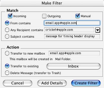
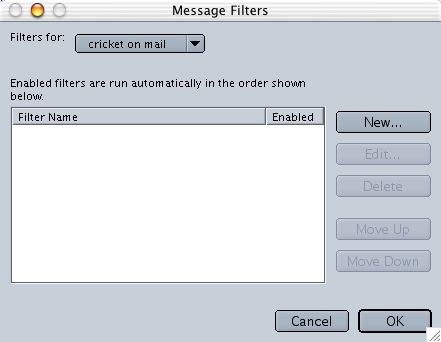
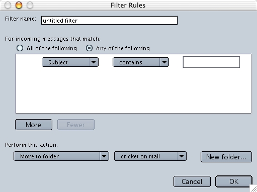
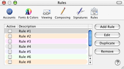
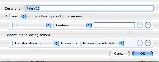
Rules were invented to help manage a flood of email to the inbox, allowing you to route messages or mark them in a limited number of ways. These have gotten so complicated that you need a separate manual to figure them out, which is why few people (except power users) actually use them. Then, new features are layered on top of rules because with all your messages scattered in a growing number of mailboxes, you need an additional feature if you want to see your messages in a coherent list again. What this demonstrates is that people want to see their email in different ways, sometimes seeing them by date, sometimes sorted by mailboxes, sometimes based on arbitrary connections that exist only in their brain (and rules can’t replicate this), and some based on ideas and relationships that haven’t been thought of yet.
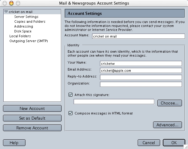
Many of these so-called solutions are just duct tape on top of bad initial design that fails to recognize that email users have simple needs and they don’t want to be confused by endless options, cryptic errors, or things that they must visit Preferences or the menus to have a chance of figuring things out.
What about power users?
The notion of a power user of email is silly. It is only because email clients have gotten so overwrought and complex that there is even the need for power users to arise in the first place. As long as you can send email to people whenever you want, send and receive any files you want, instantly find any message you want, and never miss an important message, that’s all anyone could ever expect or want from an email client. Spending time configuring a program and reading 500 page manuals is time better spent actually reading and writing email.
What could a good email client offer?
These is just a short list of what a simple, well-designed email client could do:
- Provide immediate status without using the mouse and keyboard
- Allow you to read, file, associate, and find email in the way your brain works, instead of in ‘mailboxes’ or ‘categories’
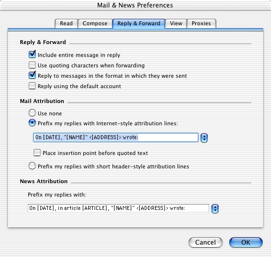
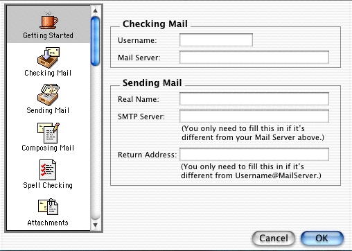
- Configure itself and never need you to visit Preferences again
- Provide unlimited stepping stones to hop to other messages, no matter what context you are in, much like hyperlinks do on a webpage
- Be fun to use!
- Allow unlimited relationships between email messages
Stakes in the ground
A list of absolute musts:
- The experience must be optimized for the user in the lower 50% of the experience spectrum, a sweet spot that has yet to be targeted by an email client
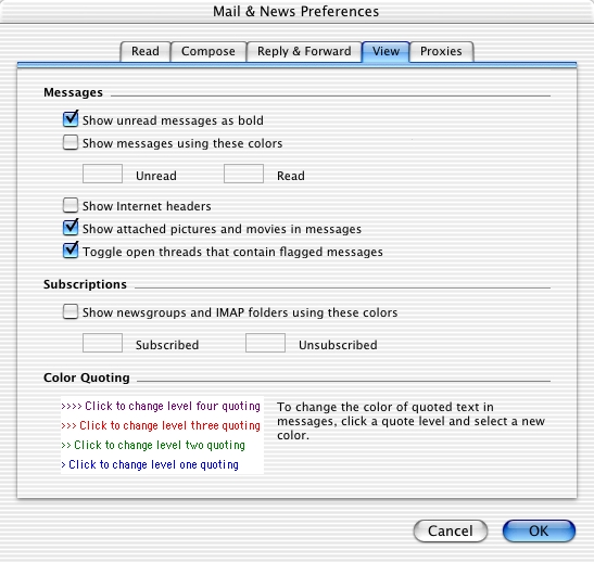
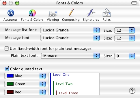
- Anything that is a user preference must be absolutely necessary to using the program (for example, setting a font size is absolutely necessary for someone with bad vision). See [[direct manipulation UI]] for an explanation of why setting a font size should be done directly in the view where the font is being displayed!
- Users must not have to know what POP, IMAP, or SMTP to use this program
- Users should not have to visit a menu to use the program
- For the first time ever, this email client must be fun to use!
Target audience
The target audience for an iMail product would start with the bottom 50% of email users, ranked by the user’s experience level. Once the functionality goals are met for the 50% group, it could gradually target more users, as long as the bottom 50% were never compromised in any design decisions.
Possible users:
- Any home users
- Casual computer users
- K-12 students
- Educators
- Less technical corporate users (administrative, for example)
- Anyone that spends less than an hour a day reading and responding to email
[Note that there are eight times as many internet users today as there were when this was written. That’s a lot of potentially novice users!]
Competitive analysis
A quick look at the complexity of currently popular email clients:
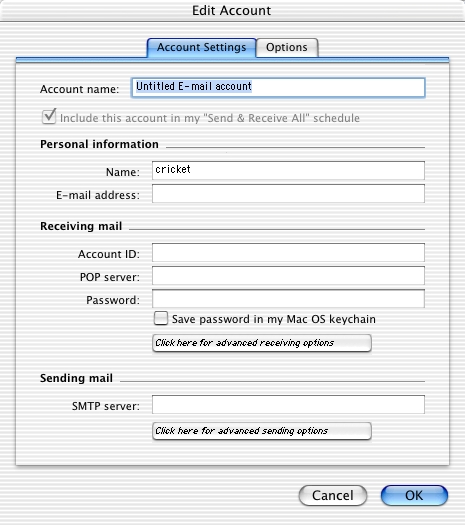
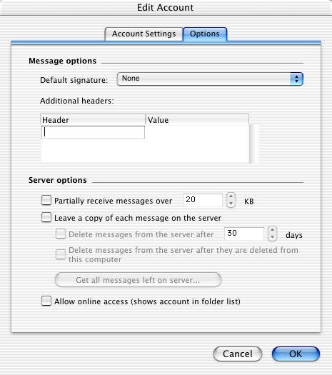
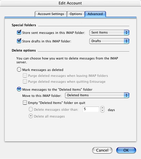
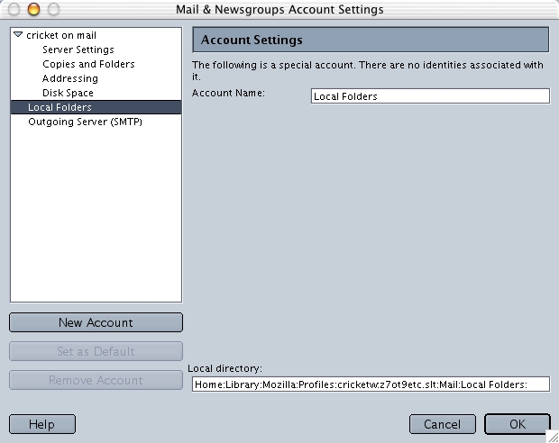
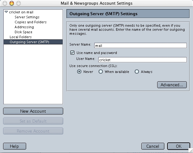
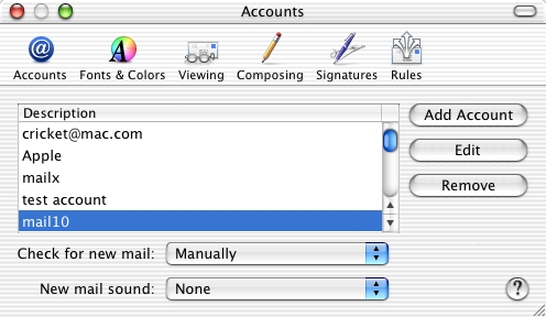
Microsoft Entourage
- 6 navigation buttons
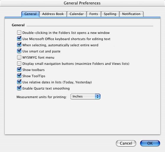
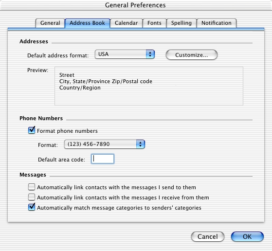
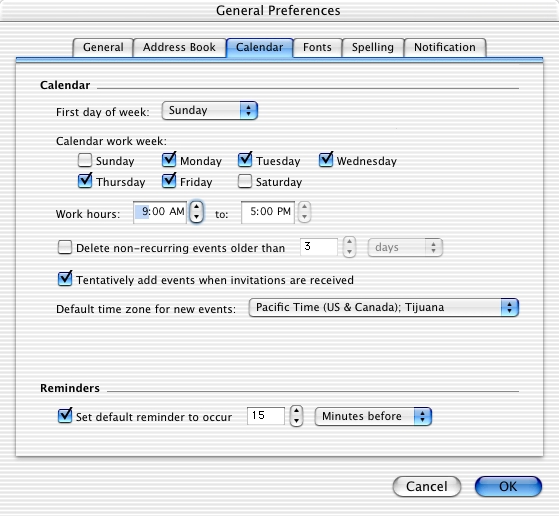
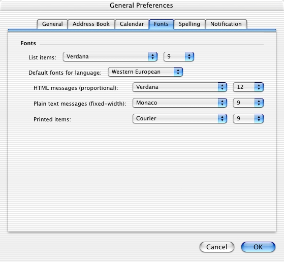
- 12 toolbar items with 56 menu items attached to them
- 9 default header columns in the list of emails
- 264 menu items
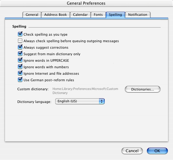
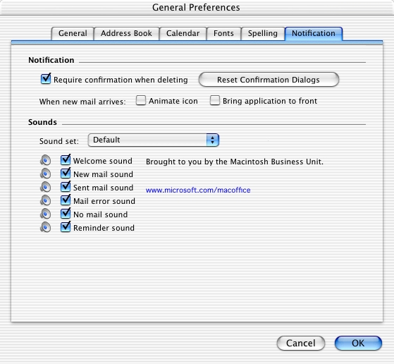
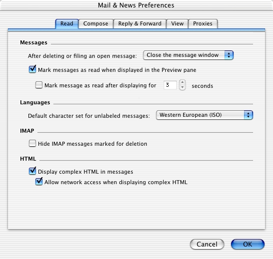
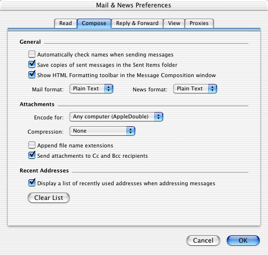
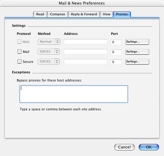
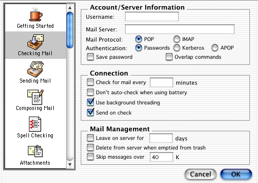
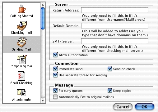
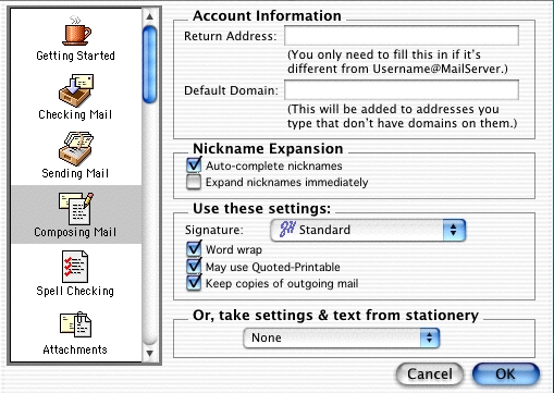
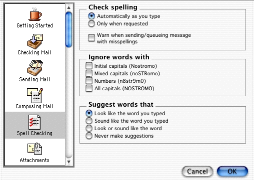
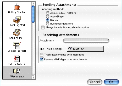
- 28 preference panels
- 9 separate entry points to set mutually exclusive preferences
- 384 total items
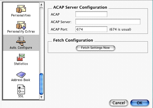
Eudora
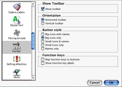
- 13 toolbar items
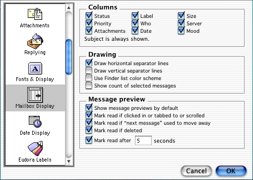
- 10 default header columns in the list of emails
- 194 menu items
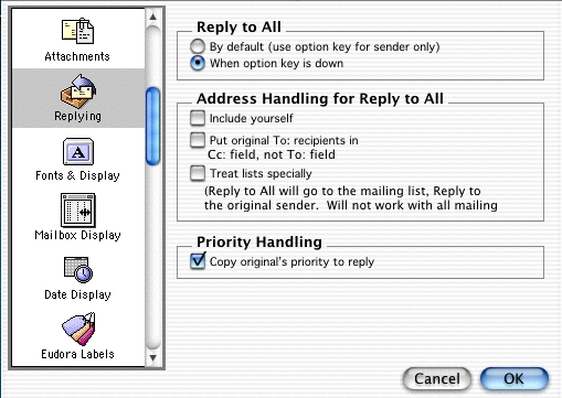
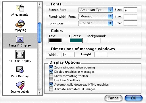
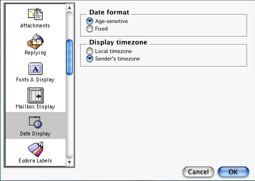
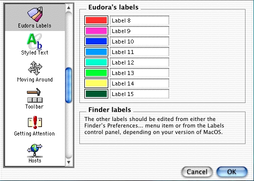
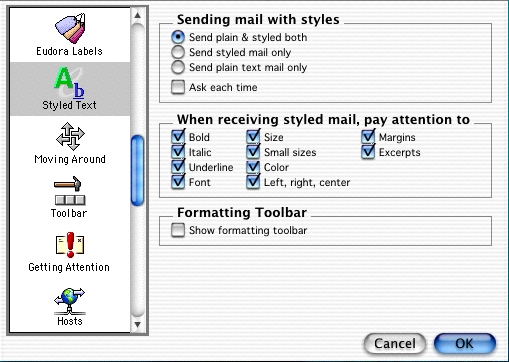
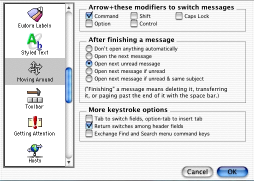
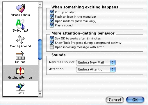
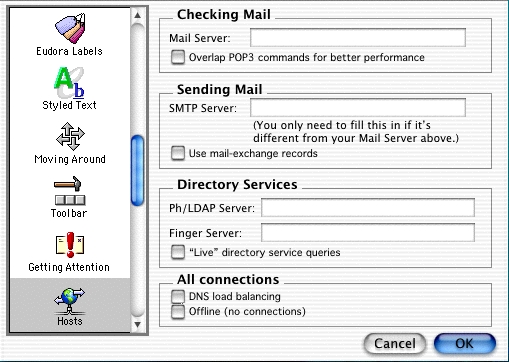
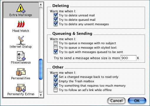
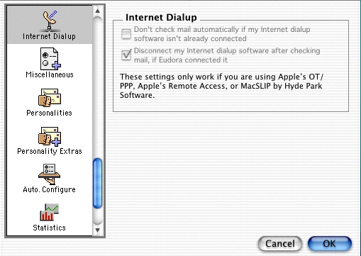
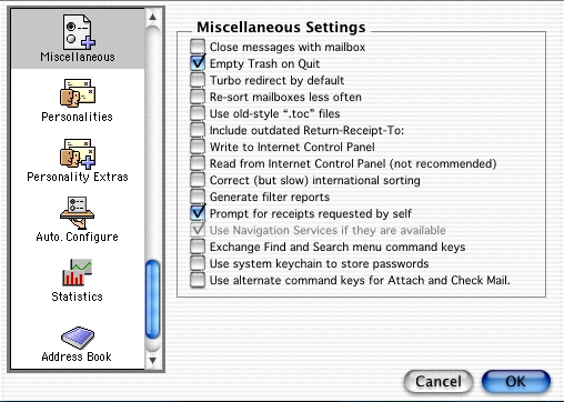
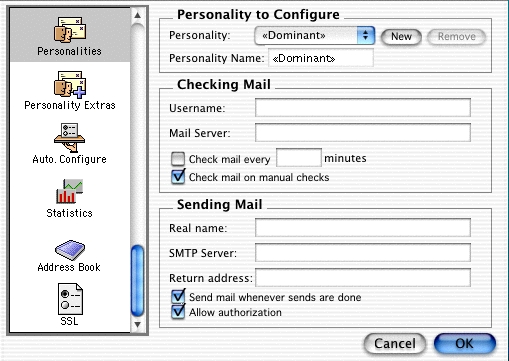
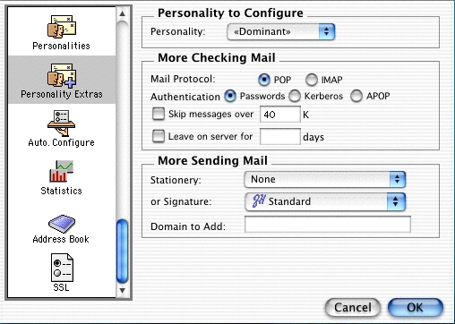
- 40 preference panels
- 6 separate entry points into preferences, all except one is mutually exclusive (Settings and Preferences both end up in the same place)
- 263 total items
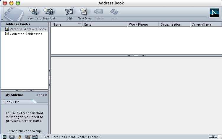
Netscape
- 10 toolbar items
- 6 default header columns in the list of emails
*174 menu items - 12 preference panels
- 2 entry points into preferences, which overlap in functionality somewhat
- 204 total items
- 9 toolbar items
- 4 default header columns in the list of emails
- 159 menu items
- 12 preference panels
- 1 entry point into preferences
- 185 total items
Possible feature set
Database-driven
Having a database to store email metadata is the single most important feature we could possibly put in an email client, allowing us a tremendous amount of flexibility that a flat, mailbox-based model cannot do efficiently.
Advantages
- Download and save incoming messages once, then only toggle metadata in the database after that. In a flat-file system, there is an atrocious amount of reading and writing of large chunks of data that is simple unnecessary
- Allows unlimited amounts of categorization and cross-categorization of emails. Most email clients right now let you put email into mailboxes, maybe color them, and maybe assign a single category to them.
- Adding new metadata wouldn’t cause backward compatibility problems. New metadata would simply be ignored by older versions
- Usage patterns could easily be recorded and leveraged for future enhancement to the user’s experience. In a database model, every time a record is accessed, the email client knows it, making it trivial to provide useful functionality like the history of emails that have been read, how often they’ve been read and in what order, how often they’ve been searched for and found, etc
What this enables
With a database-driven model, this would free the email client from having to anticipate how users may want to store, tag, and reference their email. With an unlimited set of meta-data, users could do any of the following:
- Jot down arbitrary notes on any email, then search by these notes later on
- Create arbitrary links between emails (for example, two emails that address the same issue, but sent by different people in an unrelated thread)
- Apply an unlimited set of user defined categories to emails
- Find related and specific emails instantly — text-based string and substring searching is incredibly primitive
Attachment view
An attachment is another piece of meta information that is associated with a message and can leverage a database-driven email client. The word attachment is unfortunate, implying some sort of permanent bond between a message and a file. It should instead be a loose association.
When users want to find an attachment in one of their existing emails, they usually remember fragments, like the name or part of the name of a file, maybe who sent it, maybe the type of file it was. Given the filing in mailboxes metaphor, this doesn’t lend itself very well to managing attachments.
A concept of an attachment view could present the user with a Finder-style window that lets them see all of the attachments that they have received. Just like with any email message, they could attach meta information to any of these files (for example, marking a bunch of attachments as associated with a given project they are working on). In the same way that iTunes and iPhoto provide a meta-database to organize music and photos, an email client could provide a meta-database for files that have been received. A file browser could list all attachments and allow you to sort by when you received them, who sent them, the type of the file, the size of the file, etc.
Dragging a file into a new outgoing email message could copy this file from its original location and store it in a location specific to the email client, much like iTunes and iPhoto does. Then, you could also browse and access files you have sent in an efficient and easy manner such as this.
Speech
No email client has anything but rudimentary support for Apple’s amazing speech technology. We can do better:
- UI navigation by speech
- Command and control via speech (leveraging Applescript)
- Background speech notifications (rather than dialogs and Dock bouncing, which conveys little useful information. When you’re not using your email client, you shouldn’t have to switch contexts to keep abreast of what’s going on).
- Add email addresses to outgoing messages via speech (also leveraging Applescript)
- Possibly work with 3rd party to enable voice dictation to work seamlessly
Applescript
Stakes in the ground:
- A feature or functionality should not be added unless it has Applescript support, even if only for testing purposes
- No email clients have Applescript recordability. We should be the first.
- An effort should be made to make scripting as accessible to novice Applescripters as possible, through the careful definition of terminology
Visual stationery
It’s about damn time that email started to get interesting. Right now, in order to send anyone any sort of interesting content, you need to toss in some attachments. We should strive to provide functionality that goes well beyond the current model.
Some ideas:
- Provide beautifuly stationery (like Keynote does for presentations) that users can compose email on top of. With HTML composition, this is within the realm of possibility. Imagine getting beautiful parchment emails that utilize an elegant, script font!
- Sending HTML forms to people that they can fill out and send the results to you
- Ability to easily send tabular data in a presentable format
- Eliminate the need to use an external application to create the communication you want to create
Direct manipulation UI
Stakes in the ground:
- Users should never have to hunt to find out how to do something. It should be right in front of them!
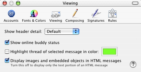
- Anything resembling a preference should be directly accessible in the UI (not in a prefs panel or in the menus)
Zero configuration
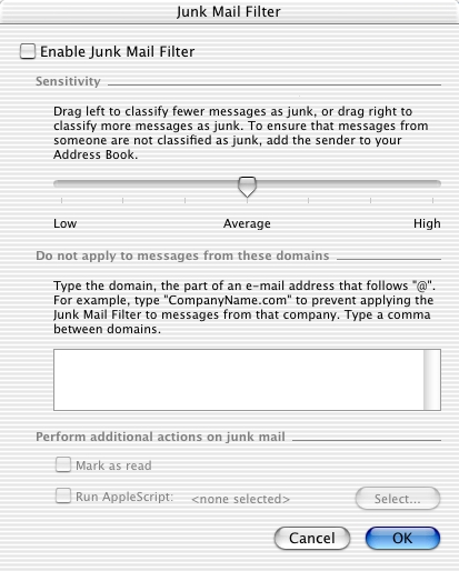
One of the reasons the Junk Mail feature in Jaguar Mail was so successful is that it required almost zero user configuration. It shipped in one mode, then offered to switch to another mode based on some internal logic. I’d like to go one step further with an email client and require zero user configuration. We should pick one way to do every action that is optimized for the novice user and make it work!
Rendezvous could also possibly be an interesting option here. If ISPs installed Rendezvous on their email servers, could we do auto discovery and configuration when the user connects to their ISP?
Zero AppleCare costs
Users should not have to call Apple to help them use their email client. Apple is not an ISP. We should strive in designing an email client that generates no calls to Apple’s call centers.
How do we do this?
- Review historical call data from Apple’s support of current email clients
- By providing immediate status, this should keep users fully apprised of what’s going on in their email client
- By defining a strict set of functionality that concentrates on optimizing one way to perform any given task, there is less room for user confusion
- Provide inline help in every context, so that a user who asks the question ‘Why is this happening?’ always has something to click on
- Work with as many major ISPs as possible to get autoconfiguration working
Column view threading
This one became a specific proposal for Mail after it was conceived for this iMail idea. I wrote up a separate article about it.
Hybrid mailboxes
[Hitting IMAP quotas is not such an issue anymore and POP usage has declined a lot, but I think there still are a few interesting ideas in here].
Goals:
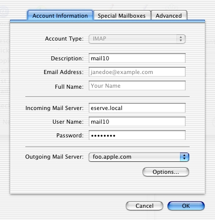
- Make the difference between POP and IMAP transparent
- Get rid of crappy old POP hacks for managing multiple accesses to the same account
- Make quota management significantly easier
- Negate the need for making mirrors of IMAP mailboxes on your local system so that you can preserve your organizational system while at the same time dealing with your IMAP quota
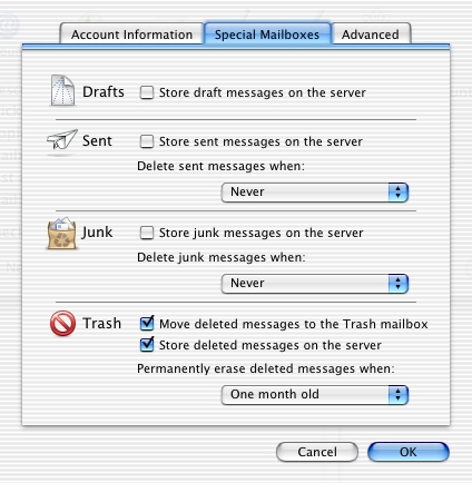
- Same goes for special mailboxes — having your sent messages on a server is nice, but when you need to free up space, you need two sent messages mailboxes, one on the server and one local
Possible solution:
- Hybrid mailboxes, where current content is kept on the server and then aged locally, based on global quota logic.
So, how would this work for an IMAP account? You would configure an IMAP account and the email client could query the server and find out the account quota. If this is not supported on the server, the user could manually enter their IMAP quota. They would then be free to create mailboxes in their IMAP account. The email client would manage the quota in such a way that older messages would be removed from the server and kept locally.
The benefit here is that the user doesn’t ever have to worry about archiving messages. It will be done for them automatically (or based on user-defined criteria). All their messages would still show up in the mailbox (on their local system) after the messages have been aged.
For the mac.com [iCloud] customer who doesn’t access their account from multiple machines, this will make their experience of using Mail significantly better.
Potential pitfalls:
- How to handle users that access their IMAP account from multiple locations. What I mean here is that it’s potentially problematic that a message that has been aged automatically by one copy of their email client will not be visible in another copy of their email client on another system (or another IMAP client).
- How to indicate what is a server message and what is a local message (if this is needed)
Conclusion:
This would go a long way towards simplifying the email experience for users, while at the same time reducing the number of configuration options, and potentially removing the need for users to care about whether they have a POP or an IMAP account. They would simply create accounts and create mailboxes and the email client would deal with the rest.
Leverage .Mac
Because Mail was designed to be an email client for any ISP, it’s stuck when trying to innovate. Working with .Mac specifically, or even with a set of the most popular ISPs, we could work to provide enhanced email experience for users of this email client. This client could be tailored, for example, to only work with .Mac, Earthlink, MSN, and other large ISPs. For their part, ISPs could get significantly reduced support costs since users of this client would have to consult them far less often since it’s not just a generic email client.
Admittedly, this is an odd proposition for an email client to be limited to specific ISPs, so this is presented only as fodder for thought! [The key thing is to have client and server work together on moving things forward]. There are some interesting ideas we could push if we had the support from specific ISPs. We could submit new RFCs to enhance functionality, then push this set of ISPs to support them.
Some ideas:
- Better quota management
- Support for hybrid mailboxes
- Security integration (PGP, etc) [Hard to believe we’re still not there]
- Handling of large attachments through an intermediary website hosted by the ISP [iCloud now supports this]
- Server-side spam filtering
- Server-side message routing [iCloud supports this]
- Server-side preference storage
Smart mailboxes
[This has since been implemented in Mail]
Out with old mailboxes, in with smart mailboxes. Some email clients call them ‘views’ and relegate them to the bottom of a long list of traditional mailboxes. Smart mailboxes would always be on and would completely replace traditional mailboxes. Like iTunes, there could be a concept of a Library, listing all of your messages, and smart mailboxes, which would be like smart playlists (or even ordinary playlists).
Plain/Rich transparency
[Not much of an issue anymore as most email clients have since switched to HTML composition]
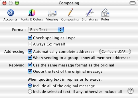
We need to figure out an elegant way to provide rich/plain text transparency. There are still known problems with Japanese and other Asian languages, but we should strive to find a way to remove the need for the distinction between plain text and rich text. Users that are new to the email game have no clue what plain text means and they shouldn’t have to. They should pick a font and start typing and have an expectation that a reasonably facsimile of what they typed will show up on the receiving end.
User feedback/bug reporting
[The Feedback Assistant handles this now].
Like Safari and some of the iApps, we should provide users a way to provide feedback and report bugs. The bug reporter could grab a snapshot and the raw source of a problem mesage, much like Safari does. We could design a database backend to gather this feedback and categorize it, allowing us a way to better determine who our users are and what they want from an email client.
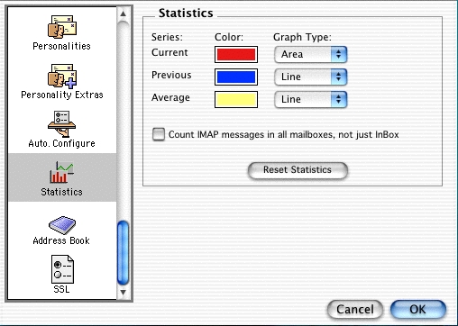
Usage statistics
[This is supported at the operating system level now, but applications have to decide what statistics to gather].
Despite all our internal efforts to simulate real-world use of Mail, information gathered from the ‘field’ would be priceless in determining usage patterns of Mail, including determining areas where users frequently stumble.
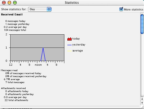
Some products, like Eudora, collect rudimentary statistics on e-mail usage. For example, with Eudora, you can get statistics on received e-mail over daily, monthly, or yearly time frames. While this information is great, I think we could dig even deeper.
As long as the system was completely voluntary, fully open for inspection by the user, and non-intrusive to the regular usage of the program, I think we would find many customers more than willing to submit this data to us to be used to improve the user experience of the program.
Some of the things we might be interested in:
- Volume of incoming and outgoing e-mail
- Memory usage over time
- Average running time of the application (do people keep it running or launch and quit it frequently)
- Download speed for incoming messages
- Type of internet connection (56K, T1, DSL, etc) [Welcome to 2003]
- Crash Catcher reports (?)
- Usage of toolbar buttons, menu items, and keyboard shortcuts
- Changes in Preferences (what is changed most often, least often)
- Attachment types sent and received
This is just a random list off the top of my head, mostly just to illustrate that it could be very interesting and useful information to get from our customers. On top of all my other arguments, I think it would be an interesting change in how we gather feedback currently, usually in a small seeding group.
As far as how this could be implemented, there are many paths we could take. As long as it was clearly presented and voluntary, I think it would be a win-win situation.
Browser-style navigation
Users have a pretty good grasp of web browser navigation and use the back/forward buttons and the history features to find previous pages they have visited. The same tools would be invaluable in an email client. Rather than always having to resort to searching, some users remember emails based on when they read them or how often they’ve read them. With browser-style navigation, users could go back to previous messages they’ve viewed, see a history of messages they’ve viewed. See the database-driven section for some ideas on how a database could be leveraged to store this information for easy retrieval.
[This could be useful for that maddening situation of “I know I saw this email!” and then never being able to find it manually or via a search].
Single search field
[This is now part of Mail and other applications].
So, the idea is that we would just have a single search box like iTunes does and you would enter search terms. Behind the scenes, we would be doing a full index search of headers and body. The results would be presented in the message list, separated by what field the search matched on. So you would see
- ‘From’ matches
- ‘To’ matches
- … and so on.
Given a database-driven set of metadata, it should theoretically be fast enough to search all messages, so the need for per-‘mailbox’ searching would be reduced.
Example-driven help system
We need a great help system, but what would be even better would be example-driven help, much like Apple Guide used to provide in Mac OS 7-8. Instead of just providing pictures and text, you could provide step-by-step examples that would drive the application itself. We could enable UI scripting such that we could pull off the same task.
[As I recall here, the biggest problem was essentially localizing movies in many languages. Perhaps someone could come up with a clever idea to automate the creation of this content].
Spatial UI hints
This is somewhat of an abstract idea, but one thing that I think a lot of applications could benefit from is something I call spatial UI hints. A couple of example of this might be the best way to illustrate:
- When you sent a message, an animation would carry the message and visually drop it in your sent messages mailbox. This would easily communicate to the user where this message went after they hit send, should they want to view it again
- When a user dismisses a dialog, a similar animation could drop it on top of a UI widget, that, when clicked, would reveal a log of all recent error messages.
POP/IMAP transparency
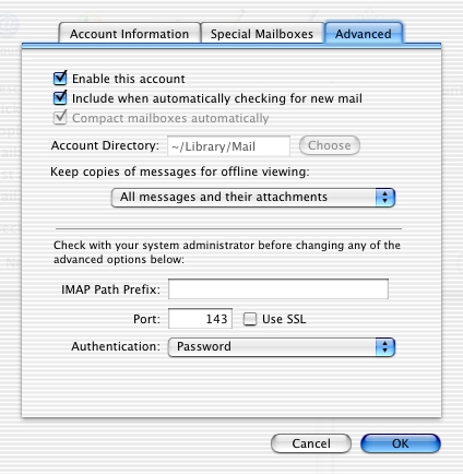
The goal of this feature would be to remove protocol-dependent settings and preferences and make everything based on how the user wants to manage their email. This removes the need to understand the subtle and not-so-subtle differences between POP and IMAP and also removes functional differences between the two account types. This prevents situations where users expect a feature that works in one account type to work in another. If we can’t provide the feature and have it work for both account types, we don’t do it.
Single-window interface
It should be a design goal to make the client a single-window application for all the most commonly used operations (if not all). Some interesting ideas here could be to put configuration right into the Mail window itself. When you click on an existing account in the account list, you would reveal configuration options for that account. When you click the + button to create a new account, the Mail window becomes a preferences window. No need for separate windows for everything.
[This is very much in opposition to the “cleaner interface” concept Apple has today where hiding UI elements is used to give the illusion of simplicity].
iLife integration
An email client should be an integral part of the iLife suite, providing easy integration with these other apps.
Some of the functionality you could provide:
- Browsing the digital libraries of the iLife apps so that they can be easily attached to new messages and sent
- Incorporate incoming attachments directly into your iLife libraries. For example, incoming images could go right to iPhoto’s library
[Anyone remember iLife?]
Immediate status
One problem that appears to be common with users of current email clients is that they frequently don’t know the current status of the application and don’t know where to go to get this information. The concept of ‘immediate status’ is that the UI design of an email application should lend itself to having a clear and easy way for users to find out the status of the application.
What types of status do users want to know?
- Are there pressing emails I need to attend to?
- Am I connected to the internet currently? [Wait, you can disconnect?]
- Am I experiencing any problems fetching email from any of my accounts? If so, what problems?
- Are there new emails on threads that I’m interested in?
- Have I gotten that email from my boss yet?
- If I’m currently sending a large message, how much of it has been sent so far? When will it finish?
Some ideas:
- Use speech when Mail is in the background
- Use the screensaver to provide email status when the system is idle, so you can know where you stand even before you move the mouse
- Establish a UI indicator that can reveal more detailed status and use it pervasively
[I never could figure out how to flesh this one out better].
End of iMail proposal
Conclusion
Email, while used by over 4 billion people(!) regularly, has been declining in importance as messaging and social media and collaboration tools forge ahead. However, people generally still want the same things out of their interactions with others so no idea is truly ever gone forever.

