Is App Library for me?
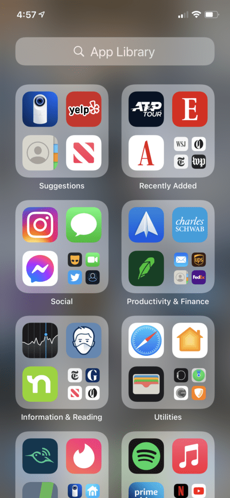
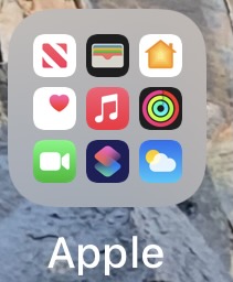
iOS 14 has a new feature called App Library and it looks like this:
You might be wondering whether this feature is for you. I’m here to help you figure out if you’re in the target market. If you answer yes to any of these, this feature might be for you.
- You’ve organized your home screens but you’re certain Apple can do a better job of it.
- You find names appearing under icons to be irritating, especially since you’ve long since memorized what all your app icons look like.
- When you click on something that looks like a folder, you’ve always wanted it to launch the app under finger than open a folder like it does in the home screen.
- You often overshoot your first home screen and end up in the widgets screen. You’ve longed for a potentially useless screen to appear when you overshoot your last home screen.
- You like organizational schemes where nothing is in any discernible or memorable order. For example, alphabetical or in order of importance.
- In such an automatic organization system, you think it’s very useful that the “Other” category appears before something like “Entertainment”
- You like when you have something that looks like a folder and clicking a big icon behaves differently than a small icon.

- You like when you click on something that doesn’t look like a folder inside something does look like a folder behaves like a folder.
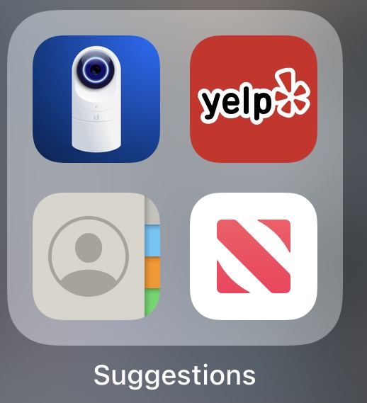
- You love Siri suggestions so much that you really wished there was a place you could go where you could only see 4 suggestions instead of the usual 8.
- You don’t use LaunchPad on the Mac and were hoping for a similar feature you won’t use on iOS.
- You were hoping for another place to search for apps that doesn’t tell you what folder the app is in.
- You hate the expression “if it ain’t broke don’t fix it”
I hope that this helps you decide whether to use this unique and powerful new feature. And I hope you realize I’m actually making fun of the feature.


