The black Dock
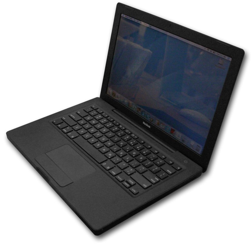
In June 2006, Apple shipped the plastic MacBook, available in both black and white. I received a black model at work sometime that year.
It was plastic, but at the time I thought it was beautiful. Little did I know that, at around the same time, a redesign of the Dock was taking place.
Now, I actually don’t know for sure the Black Dock was inspired by the black MacBook, vice versa, developed in unison, or just a coincidence.
The look
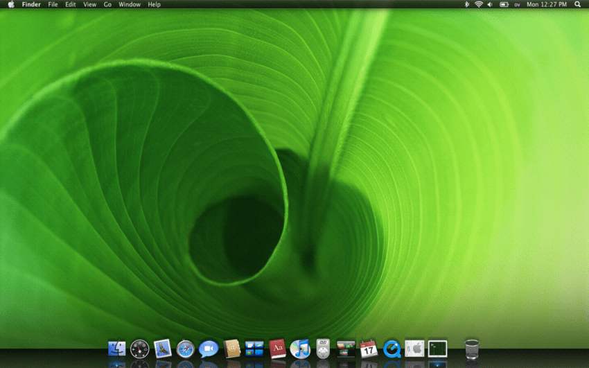
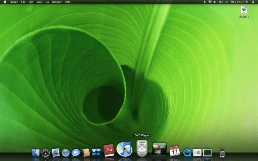
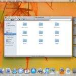
Sadly, I don’t have great images showing the Black Dock, but here’s what I have.
If you ignore the overdone reflections, the look of the Black Dock is actually pretty nice. Sadly, I don’t have a movie, but imagine swiping over the icons and only having the icons moving, just dancing or skating above the Dock.
Also, the icons cast a shadow against the Desktop picture, giving it a bit of a 3D look. This was left in for the shipping version.
The behavior
The best part of the Dock redesign was how it felt. The platform the icons sat upon went end to end rather than just around the icons. This was very controversial.
With magnify on, though, swiping over the Dock showed the icons dancing and gliding and hovering above the Dock, rather than the Dock surface shrinking and growing. You could just swipe over the Dock all day long and never get tired of it.
Try magnify on your Dock right now and you’ll see what I mean by the border around the Dock changing and it feeling less than smooth. Not quite like butter.
Marriage
The marriage of the Black Dock with the Black MacBook was incredible. The Dock surface just became part of the frame of the MacBook and the icons danced on top. I keep using the term “danced” but that’s really what it felt like.
Untimely death
Eventually, this concept was killed and we went to the 3D look that was not so popular. When I saw The Black Dock die to be replaced by this hideous Dock below, I honestly felt sick to my stomach. I loved the Black Dock and it was one of the most beautiful things I ever worked on.

Bonus photo
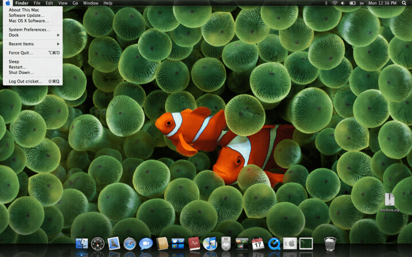
You’ll notice in the photos above that the menu bar was also black, something that didn’t show up in macOS for many years. But this menu is pretty interesting.
Note
We have most of this in present day macOS, except the Dock shelf and the inverted menus, so it’s not like these ideas died forever, just took different form.
This is very common in the iterative design process at Apple. You may see a really cool concept and then it disappears for some technical or design reason. Later on, it comes back.
