Rising from the ashes: Stage Manager
Every year I worked on macOS/iOS, I would get attached to a handful of features that would ultimately get axed. Over time, I grew de-sensitized to it, but sometimes a feature would come along that I would never be able to get over.
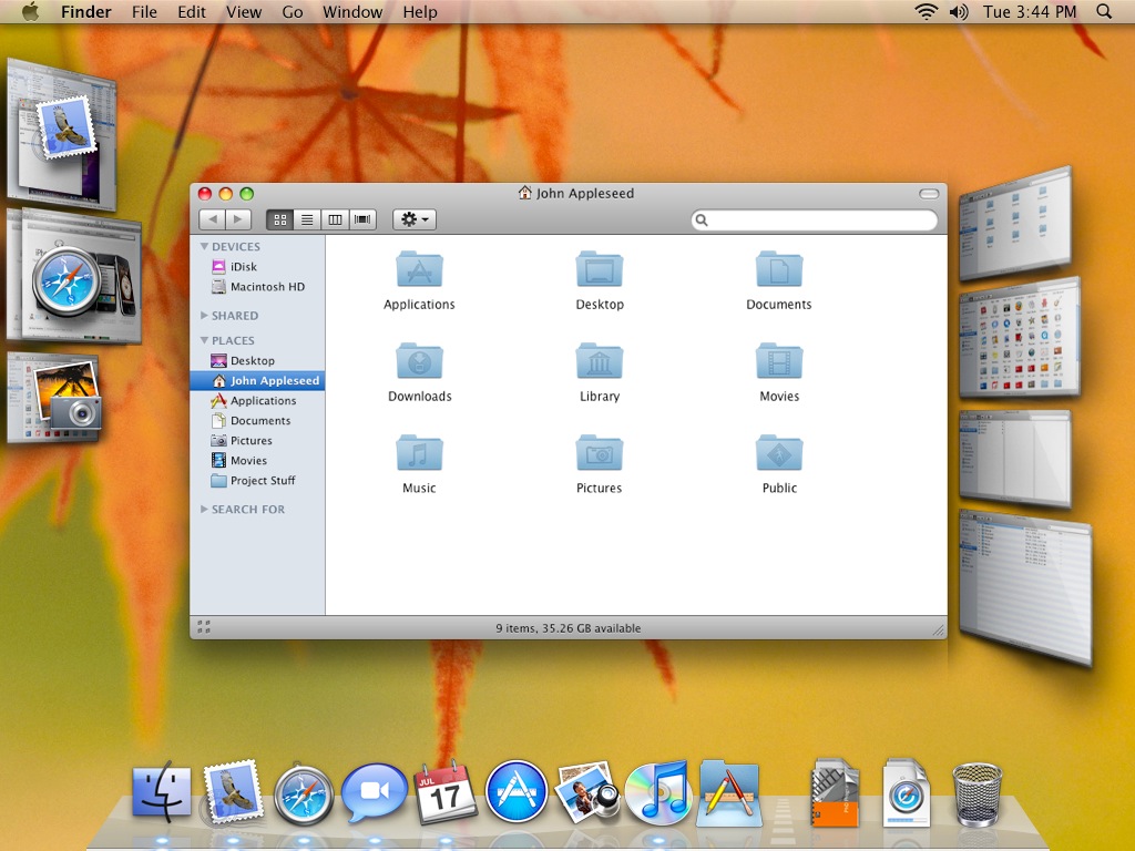
While Apple was busy transitioning to Intel, I was working on the software team responsible for Dock, Exposé (later Mission Control), and Dashboard (now deceased). We did a lot of experimenting with new interface concepts; one was a radical new way to manage apps and windows. It effectively made the existing Exposé irrelevant as well as the Dock as a way of managing running apps and windows.
It never became an approved project, but I continued to live on it for many months until it just stopped working with newer versions of hardware and software. By then, our team had moved on to other things.
Fast-forward 15 years
At WWDC 2022, I was very excited to see Apple announce a new feature for macOS and iPad called Stage Manager. It’s a radical new way to manage windows and likely makes much of Exposé and the Dock functionality irrelevant. Sound familiar? Well, it turns out it looks familiar too!


Now, it’s not unusual for a feature to get killed, only to re-surface in a future release. But this has to be some sort of record! In addition to being a macOS feature, it’s also a much more elegant way to do multitasking on the iPad.
Apple has put up nice pages showing the new features of macOS Ventura and iPadOS 16. They include screenshots and movies showing how Stage Manager works on the Mac and on iPad.
How do they compare?
Given how long it’s been since I used the 2007 version, I don’t remember all of the interaction details. But there were key differences between it and Stage Manager.
Both took over the positioning and size of all windows. Back then, we saw this as a huge win for novice to intermediate users who struggle with window management.
Both features showed background applications as groups of windows along the left side of the screen. But, it also showed windows that weren’t frontmost in a column on the right side of the screen. So, in addition to being able to focus on one app at a time, there was the ability to focus on one window at a time if you wanted.
Both let you view multiple applications at the same time.
Although they look visually similar, the Stage Manager interface is definitely much more refined and compact. Part of that is because it pre-dated retina displays, so there was only so much shrinking you could do before it just looked awful (or more awful). Without the green-light, it never got sufficient attention from the Human Interface team. Visually, Stage Manager looks really nice!
Stage Manager appears to be positioned as a power-user feature which I think is a shame. I’d much prefer to see it as something you pick in Setup Assistant or choose in Settings rather than hidden in a menu somewhere. I think this is something that would be especially appealing to a new Mac user. On the iPad, I don’t see any reason to use the existing multi-tasking UI anymore.
Conclusion
Never say never! I’m thrilled to see this feature and looking forward to trying it out and providing feedback. I’ve not filed any bugs since I left Apple in 2019, but this may get me back into the saddle.


