Prototypes: Viewing minimized/recent documents
This was a feature Apple prototyped but never shipped that was near and dear to my heart. The feature addressed two things.
First, people often remember the app they used to create a document or when they worked on it last. It’s harder to remember the name of the document or where they put it. I see people freeze up when the OS asks them where to file something and what to name it. I think this is still a great shortcoming in macOS.
In addition, there’s the question of why does it matter what the name or location of a file is? Why waste time naming and filing things away if you can find it because you remember you created it in MS Word yesterday?
Secondly, when it came to minimized windows, especially those minimized into the application icon—a feature that still exists today—I saw that people would perceive those windows as lost.
Minimized windows
In the mid-2000s, there was an effort to address these two issues, but the focus was on the less-interesting-to-me minimized windows issue. However, for windows that are minimized into the Dock icon—a feature that still exists today, something had to be done. Eventually it was resolved in a rather boring way.
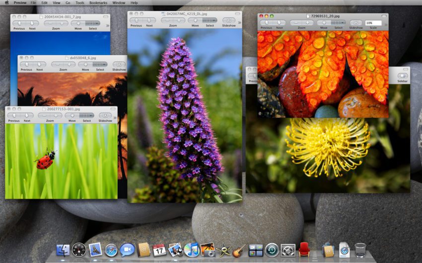
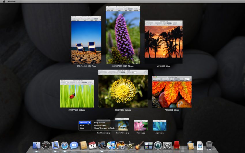
To follow the history of addressing the minimized window issue, here is a screenshot of Preview.
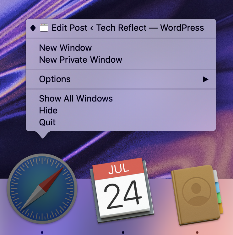
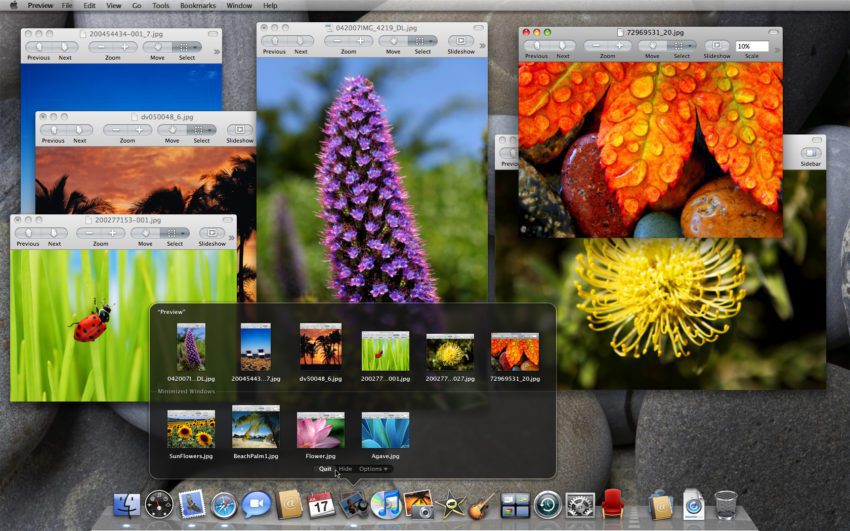
Clicking and holding on the Preview icon would display all the “open” windows. Note that this is a precursor to what would eventually become Dock stacks.
Now, this doesn’t seem quite as powerful as it should until you imagine that you are chatting in Messages and you want to open a Preview document. A click and hold gets you access to all open documents without leaving the context of Messages.
This is akin to how Dock stacks work today where clicking on one doesn’t change the frontmost application. The next images simply show that the Dock functionality you expect is still there.
Now this is where it got more interesting.
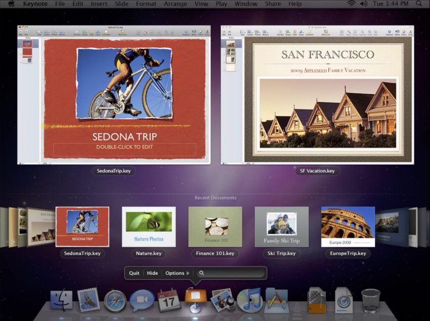
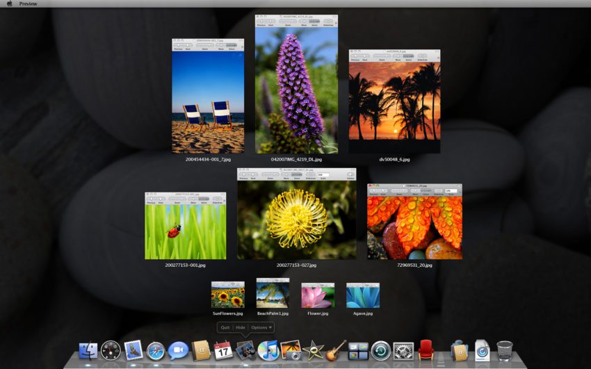
If you chose that option, you would see an arranged view of all the open windows for the application as well as minimized windows. Here are some variations on that theme.
Recents
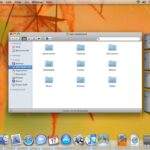
Finally, there was a token effort to look at recents and here is the only screenshot I could find. Unfortunately, it’s very small. The idea is click-and-hold on any document-based application icon would show open windows and recently opened documents.
I think this was a far superior experience to opening an app and being dumped in a folder that may or may not contain the document you want. It may have documents going back years (yes you can sort them if you in the right view.
It wasn’t the greatest interface but was something I really loved.
Conclusions
I worked on a lot of great features that shipped that I’m proud of. But, the agony of seeing something die that you loved can be very painful.
On the positive side, sometimes bits and pieces or even a completely reimagined version of something you love sees the light of day.
