Magic Mailboxes
I worked on the Mail team from just before Public Beta thru Tiger. One of my proudest achievements on the team (and at Apple) was brainstorming with my team members and pushing an idea we internally called Magic Mailboxes and eventually became called Combined Mailboxes.
Some of the ideas came from my unique job which partly consisted of supporting everyone in Software Engineering on using Mail. And not everyone was an uber-geek engineer so I got to see what all sorts of users struggled with.
This feature was being developed in 2002 and shipped with Jaguar. I have to give my colleague Paul Marcos a lot of credit for brainstorming and being a strong supporter of the concept.
If you’ve ever worked on software that must be used by everyone from the most novice user to the most advanced, this may resonate with you. With Mail, it was mandatory because there was a lack of email clients (and anything, really) when macOS first shipped.
Novice case
For this example, I’m going to presume that a novice user has one account, probably a POP account. Here’s what it looked like in Mail:

This wasn’t the worst thing in the world, but a few things always bothered me.
- Most novice users, at least at the time, never created mailboxes! Volume of email was low and people would read and delete. Hard to imagine. So what is this Personal Mailboxes thing, always empty, at the top of the list.
- INBOX wasn’t at the top of the list and it’s the most important mailbox and wasn’t made special in any way. It’s the most clicked on mailbox.
- All the important mailboxes were one level below the top in the hierarchy
- Many novice users don’t deal with disclosure triangles well so they would accidentally close their account and wonder where their inbox was. We always wanted the inbox to be visible.
Personal Mailboxes was also a terrible name. We often got questions about what they were and what they should use them for. In a common user case, the answer was nothing.
Advanced case
Here’s what it looked like in Mail:

As you add more and more accounts, this model falls apart. With three accounts, you have 3 inboxes, 3 drafts, 3 trashes, and so on.
Why does this matter? Well, here are some scenarios:
- You have unread messages in multiple accounts and you have to click INBOX three times
- You have a draft, sent, or trashed message, but you can’t remember which account so you have to check all three
Truthfully, though, many advanced users were fine for this, which made our redesign that much more challenging. How to make both groups happy.
Marketing
Sometimes marketing would provide us with market research, and in this case, we learned that the vast majority of users only had one account. I wish I remembered the number, but I think it was in the 70-80% category. That’s good. So, we’d only piss off 20-30% of our users. 🙂
Redesign
Here was the idea behind the redesign:
- The 4 “combined mailboxes” (INBOX, Drafts, Sent, Trash) would get top billing, positioned at the top of the list, with unique and large icons to distinguish themselves
- All other account mailboxes (local or IMAP) would be below these combined mailboxes
- Clicking on any of the combined mailboxes would show the messages for the one account, if that’s what the user had
- Clicking on any of the combined mailboxes would show the union of all the messages in all accounts
- Flipping open a disclosure triangle on one of the combined mailboxes
Selling it
This was the first time I ever mocked anything up (and I suck at it) and the first time I tried to sell an idea. I recall most of the Mail team was on board, with the more power-user leaning members being skeptical.
Marketing had to like it and the Human Interface Group had to like it since it was a significant change in how Mail worked
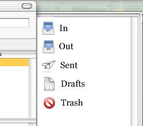
Single account case
I made many mockups, but sometimes you only need one. I created one for what a new user with one account would see on first launch.

The “Out” box, like today, would appear only when a messsage was in process of being sent. Also worth mentioning is the shortening of the mailbox names and bringing them in line with how things were named in the rest of the system.
- INBOX -> In
- Sent Messsages -> Sent
- Deleted Messages -> Trash
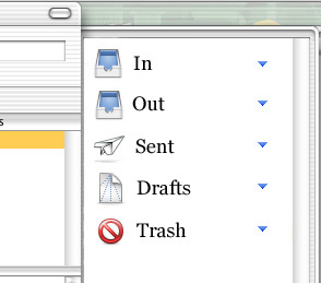
Reaction
This was presented in a meeting with our Human Interface contact and he said, paraphrased: I love it, ship it. Now, he wasn’t entirely serious as he hadn’t seen it all, but he was very enamoured of the simple case. Let me put them side by side.
Doesn’t seem like much, but if you’ve followed along, hopefully you get it. This is a big win for novice user usability. You also have to realize that no other email client did things this way.
Once you see the way multiple accounts were changed, maybe it’ll become more apparent.
Multiple account case
This is where my mockup skills start to fall apart, but hey, in the end in worked. Since I’ve explained the concept thoroughly, I’ll just go through and narrate these screenshots.
This first one is the default case of a user with multiple accounts and the first launch experience. Presume for this that they have no local or server-side mailboxes for the purposes of explaining this.
If the user clicks on any of the 5 mailboxes, they get all the messages for all their accounts.
In this one, the user has flipped the triangle for Sent and now they can click on individual accounts and see their sent messages.

This was an attempt to handle both local and IMAP mailboxes. Interestingly, this is how Mail still does it today with the “On My Mac” and sections for the server-side mailboxes for IMAP accounts

Except for this last one, the mockups went well. A lot of time was spent hashing out what to do with local and server-side mailboxes and in the end I think it turned out well.
Reaction
I was fairly terrified when it got deployed amongst my peers and some of the hard-core grumpy users were very upset. It’s hard when you use a program ALL day long and someone changes it fundamentally. For most people I just had to explain that they could just flip open all the triangles and it sorta-kinda worked like before.
The big icons were NOT popular for advanced users who missed the screen real estate so we put in an option for smaller icons.
Novice users either didn’t notice or really liked it a lot. And I got less support questions from them.
One of the rare features I worked on that managed to help both novice and advanced users at the same time, which is usually extremely difficult.


 easter egg")
